Wednesday, April 18, 2012

Final 8!

50. Kitsch on a car! Carlashes are definitely Kitsch. They're overly sentimental and cheesy.

49. this is a camera made to look like a box of Velveeta mac and cheese. Thats Kitsch. Its vulgar, and overly sentimental.

48. Some table settings that are definitely Kitsch. They have bright colors, have dramatic expressions and are overly sentimental.

47. Caesars Palace is THE Kitsch location. Vulgar and over the top. In poor taste. Definitely Kitsch

46. Do you remember this guy? Dennis Rodman was a Kitsch personality. His philosophy seemed to be brighter and more vulgar = better. 

45. Kitsch Food! This is a Jello mold made in the Kitsch style. It looks like a delicious bloody mary Jello mold. Can they even make that? Its Kitsch by appealing to that 50s diner look and being overly sentimental.

44. A chair that is pure Kitsch. My sister recently bought a foot rest like this. Its vulgar and in poor taste. That makes it Kitsch.

43. These are called Uglydolls. They are definitely Kitsch by the use of bright pastel colors and their overly sentimental nature.

Post Three


42. Lets discuss a different take on Kitsch that is more applicable to today. Kitsch also means vulgar, grotesque, or considered to be in poor taste. Using that definition this sculpture by Jeff Coons certainly fits.

41. Here is another well known work of art that fits the above description. With an emphasis on the poor taste.

40. Takashi Murakami is a modern artist who's work is often considered Kitsch. He uses bright colors and over the top grotesquery.

39. Another piece by Murakami, this one is more cute but still Kitsch because of how over the top and in your face it is with the bright colors.

38. This is a painting by Mark Ryden. He employs Kitsch themes in his paintings which are vulgar, pretentious and involve oversized caricature type faces.

37. Another Mark Ryden painting further exemplifying his Kitsch style. This is Kitsch for the same reasons as the painting above.

36. Andy Warhol was a master of Kitsch. His work was pretentious, used bright colors, was vulgar, and many considered to be in poor taste.

35. Another Warhol, this painting is different, but also Kitsch. It shows the whole poor taste thing off and is also pretentious. 

34. One more piece of pop art, this one by Rosenquist, also shows off the vulgarity and pretentiousness of Kitsch.
33. This is an art piece by Damien Hirst. It is a skull made out of platinum covered in diamonds. Vulgar, grotesque and pretentious. Definitely Kitsch.

32. New school tattoos are definitely Kitsch. New school is the style people get tattoos in these days. Then include bright colors, dramatic poses, stars/ startbursts, and are often vulgar in that they are over the top crammed full of stuff.

31. Another new school tattoo. This is also Kitwch for the reasons above.

30. And one of the people we have to thank for the new school tattoo trend. Ed Hardy's work is definitely Kitsch for the reasons above. Ed Hardy usually appeal to the lowest common denominator which also makes it Kitsch.

29. An Ed Hardy dress. Yeah he makes clothes too. Again bright colors, vulgarity, considered to be poor taste.

28. That brings me to some Kitsch fashion design. These are vulgar, pretentious and over the top. Definitely Kitsch.

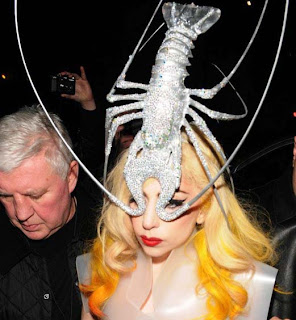
27. And THAT bring me to Lady Gaga. A pop icon who is rocking Kitsch fashion most of the time. Her outfits are usually vulgar, pretentious, overly dramatic and involving bright colors.

26. This is a bit of Kitsch Architecture. It is overly sentimental and vulgar.

25. Here is a picture of modern Kitsch interior design. It is vulgar, over the top, and considered to be poor taste.

24. One more example of Kitsch interior design, this one harkening back to the retro Kitsch of bright pastel colors, and rounded geometry on the legs.

23. Pee Wee was Kitsch all around. His set design and his clothes were Kitsch they were 50's style with bright colors, rounded geometry, and were overly vulgar. His show was vulgar and over the top and a bit insane.

22. Pee Wee's house which was probably the most Kitsch architecture imaginable, with the geometry and the bright colors. Not to mention the vulgarity of the sphinx on his roof..

Monday, April 16, 2012

21. Now for more Kitsch! Ugh. Let me be clear in saying that I don't like this stuff. I just find it morbidly fascinating. I decided to throw in some local pics here. This is a chair sold at Suburban Furniture on portland by all the other furniture stores. Its qualifies as Kitsch by using the rounded kidney type shapes and the bright gaudy colors.

20. Another find from Suburban Furniture. Can you believe how ugly this thing is? Its a bed by the way. Its Kitsch again because of the rounded kidney type shapes and the bright colors.

19. One more from Suburban Furniture. This one I actually like a bit. I suppose this could also qualify as post-modern. I think a lot of Kitsch could be confused with or doubly classified as post modern. This has the blatant kidney shape giving it a Kitsch look.

18. Here is another local picture. This is a local Rollerderby team named the Victory Dolls. Their whole look/ team persona is very retro and tries to achieve that Kitsch look and feel with a slightly edgy twist. Their look is Kitsch by emulating that 50's pin up/ overly gaudy era in their style. They do this with bright colors and tattoos, classic cars, and crass behavior ;).

17. CLassic cars brings me to, well classic cars. These cars used the dramatic fins, bright colors, and rounded geometry. I chose this as my classic car because it ties into my next photo.

16. Quintessential Kitsch: the Batman TV show from the 60's. Like the Jetsons this show has it all, the bright colors, the kidney type shapes, the overacting...

15. Remember these guys? These are the spitting image puppets, which still give me nightmares. They were big in the 80's I think. I would classify them as Kitsch because their caricature like nature and how over the top and grotesque they were.

14. The video game fallout 3 takes a Kitsch environment and then destroys it. You play a character in a post apocalyptic America where the remains of civilization are distinctly Kitsch. In this picture you can see the classic car, and the fake space ship both using the bright colors and rounded geometry.

13. Another picture from Fallout 3 exemplifying more of the Kitsch styling with this graphic showing an Indian Chief, and various starburst like elements.

12. Poodle skirts! Now thats Kitsch. Bright colors, over exaggerated in size, and poodles... Why poodles? I have no idea.

Sunday, April 15, 2012

First post!

So this is my first post in the class assigned blog where we find pictures from a specific design movement. I have chosen to do the American Kitsch period. Lets start the countdown!
11. When we started discussing  American Kitsch the first thing that came to my mind was my favorite cartoon from childhood. The Ren and Stimpy show. This show includes many of the main characteristics of Kitsch; sunbursts, bright colors, charactures, vulgarity, kidney shapes, the list just goes on and on.
10. Another picture from Ren and Stimpy to further illustrate its Kitschy nature. Note the shapes of the electronics using the kidney like, very Kitschy design. Also note the bright colors and the inclusion of space, something that Kitsch often seemed to be fascinated with.
9. Here is a picture done by Frank Frazetta. Frazetta took gritty medieval scenes and brought them into the Kitsch era, using bright colors, starbursts, exaggerated poses and again the inclusion of the space obsession.

8. Another Frank Frezetta that I had to include. This is a picture from his book John Carter of Mars. John Carter of Mars was recently made into a movie staring a man named... believe it or not, Taylor Kitsch. Again not the overly dramatic poses, the space inclusion.

7. Here is a picture from the Jetsons. I Had to include this picture because it truly doesn't get more Kitsch than this. We have the starbursts on the floor and ceiling, the kidney shapes, the bright colors, the space obsession, the whole shabang really.


6. These are some utensils currently sold at target. I think they meet the criteria of Kitsch because of their bright colors, the shapes having rounded edges and the starburst pattern.

5. This is a picture of Red Robin, a modern day restaurant that tries to harken back to the hay day of burger joints by decorating in Kitsch. Here we have the bright colors, rounded geometry/ kidney type shapes, and diner aesthetic.


4. This is a modern phone made in the Kitsch style, using a bright almost pastel orange, and the rounded geometry.


3. This is just a picture of some interior design in the Kitsch fashion, using bright colors, rounded shapes, and what appear to be starbursts.


2. This is a picture of a retro McDonalds, employing Kitsch design by emulating a 50s diner. Complete with bright colors, and strange geometry.

1. Here is wonder woman, possibly the most Kitsch superhero I have heard of, wearing her bright colors and stars